Best Colors for Painted Kitchen Cabinets in 2026 (Utah Guide)
Best kitchen cabinet paint colors for 2026 in Utah. Trending colors, two-tone ideas, finish recommendations, and tips from a professional cabinet painter.
White cabinets are not going anywhere, but 2026 is the year that Utah homeowners are starting to take risks. We are getting a lot of requests for white, but we have also started to see more blacks, grays, and greens appearing in kitchens. The color palette is opening up, and the results have been impressive.
If you are thinking about refinishing your cabinets, here is what is trending, what works in Utah homes, and how to make a color choice you will not regret.
The Shift Away from All-White Cabinets
For the past decade, white cabinets have dominated kitchen design in Utah. And they still work. A clean white kitchen photographs beautifully, appeals to the widest range of buyers if you are thinking about resale, and makes smaller kitchens feel more open.
But all-white kitchens are starting to feel predictable. Homeowners are looking for warmth, personality, and visual interest. The shift is not away from white entirely. It is toward using white as one element in a more layered, intentional color scheme.
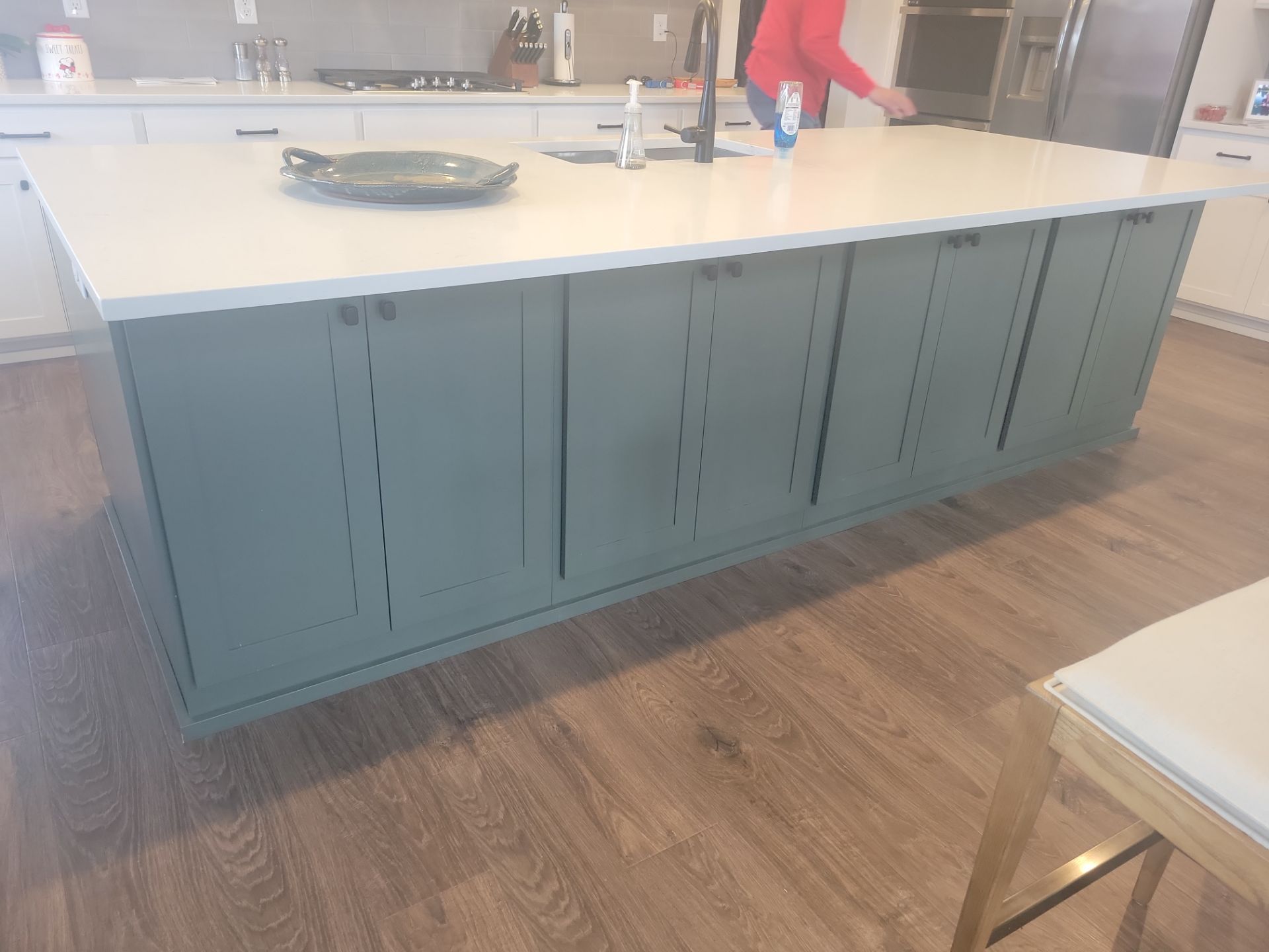
The biggest driver of this shift is two-tone kitchens. Instead of white everywhere, homeowners are painting upper cabinets or perimeter cabinets in white and doing the island or lower cabinets in a contrasting color. This approach gives you the brightness of white with the personality of color.
Top Cabinet Paint Colors for 2026
Here are the colors we are seeing the most demand for, with specific Sherwin-Williams color names since that is the brand we work with most:
- Classic white. Still the most requested color. Snowbound, Alabaster, and Pure White are the go-to options. Snowbound has a very slight warm undertone that keeps it from looking sterile. Alabaster is slightly creamier. Pure White is the cleanest, most neutral white.
- Soft grays. Agreeable Gray and Repose Gray translate beautifully to cabinets. They read as sophisticated without being cold, and they pair well with almost any countertop and backsplash material.
- Black and charcoal. Tricorn Black and Iron Ore are showing up on islands and lower cabinets. Black is bold but surprisingly versatile. It grounds the kitchen and creates a strong contrast with lighter countertops and upper cabinets.
- Greens. This is the biggest growth area for 2026. Sage (like Evergreen Fog), forest green (like Rosemary or Pewter Green), and muted olive tones are showing up in kitchens across Utah. Green cabinets bring a natural, organic warmth that pairs well with wood floors and stone countertops.
- Navy and deep blue. Naval by Sherwin-Williams is still popular, especially for islands. It adds drama without the intensity of black.
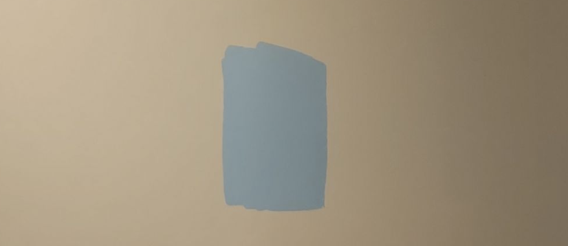
We recently accented a kitchen island with a baby blue color on a Layton project. It gave the kitchen character and broke up what would have been an all-white space. The client loved it, and it made the kitchen feel more personal without being overwhelming.
Two-Tone Cabinets: How to Pull It Off
Two-tone cabinets work when the contrast is intentional and the colors complement each other. Here are the approaches that work:
- White uppers, colored lowers or island. This is the most common and the safest. The white uppers keep the room feeling bright and open, while the colored lower cabinets or island add visual weight and personality.
- Warm tone on top, cool tone on bottom (or vice versa). Mixing warm and cool tones creates visual tension that can work beautifully if the tones are balanced. A warm cream upper with a cool gray-green lower, for example.
- Same color family, different values. Light gray uppers with dark charcoal lowers creates depth without introducing a second color entirely.
What does not work: two completely unrelated bold colors (like red uppers and green lowers), or colors that are too close in value, which looks like you bought the wrong paint for half the kitchen.
How to Choose a Cabinet Color for Your Kitchen
Choosing a cabinet color is a bigger decision than choosing a wall color because you are going to live with it for 8-plus years, and it is more expensive to change. Here is how to approach it:
- Start with what you cannot change. Look at your countertops, backsplash, flooring, and hardware. These fixed elements dictate which colors will work and which will clash. Your cabinet color needs to complement them, not fight them.
- Consider the light. Utah kitchens with south-facing windows get a lot of natural light, which can wash out lighter colors and make darker colors feel more balanced. North-facing kitchens tend to lean cooler, so warm-toned cabinets can help balance the light.
- Think about the adjacent rooms. Open-concept layouts mean your cabinet color is visible from the living room and dining area. It needs to work with the whole space, not just the kitchen.
- Test before you commit. We provide complementary color consultations for every cabinet project. Our process involves working with a local designer who meets with you, evaluates your space, and helps you select the ideal color. We can create renderings to help you visualize what your kitchen will look like. If you prefer a more accurate visualization, large color samples on the cabinet doors (not just small paint chips) are the best way to see how a color will actually look in your specific light.

What Finish Works Best on Cabinets?
The finish (sheen level) affects both the look and the durability of your cabinets:
- Satin is the most popular choice. It has a low, soft sheen that hides minor imperfections while still being easy to wipe clean. Most of our clients go with satin.
- Semi-gloss is slightly shinier and easier to clean. It reflects more light, which can highlight any imperfections in the surface but also makes the cabinets pop. If you prioritize easy cleaning (families with young kids, heavy cooks), semi-gloss is a smart choice.
- Avoid flat and matte on cabinets. We would not normally recommend anything lower than satin for cabinets. Flat and matte finishes show fingerprints, are harder to clean, and do not have the same durability as satin or semi-gloss. For more on how finishes work, check our finishes guide.
Test Before You Commit
Do not pick a cabinet color from a 1-inch paint chip under fluorescent lighting at the hardware store. Colors look dramatically different based on the light source, the surrounding surfaces, and the size of the sample.
Here is what we recommend:
- Get large samples. Buy sample quarts and paint a piece of poster board or a spare cabinet door. Live with it in the kitchen for a few days. Look at it in morning light, afternoon light, and evening light with the kitchen lights on.
- Look at it against your countertops and backsplash. A color that looks great on its own might clash with your existing finishes.
- Take advantage of a professional consultation. Our designers have seen hundreds of kitchens. They know which colors work in which lighting conditions and can save you from a choice you will regret.
FAQ: Cabinet Paint Colors in 2026
Ready to Refinish Your Cabinets?
If you are ready to give your kitchen a new look, cabinet refinishing is the fastest and most affordable way to do it. We offer free estimates and a complementary color consultation with every cabinet project.
Call us at (801) 512-2916, and we will help you find the perfect color for your kitchen.