Color Psychology: How Paint Affects Mood in Your Home
Learn how interior paint colors affect mood, focus, and comfort at home. Research-backed tips for Utah living rooms, kitchens, and whole-home color plans—plus when a color consultation helps.
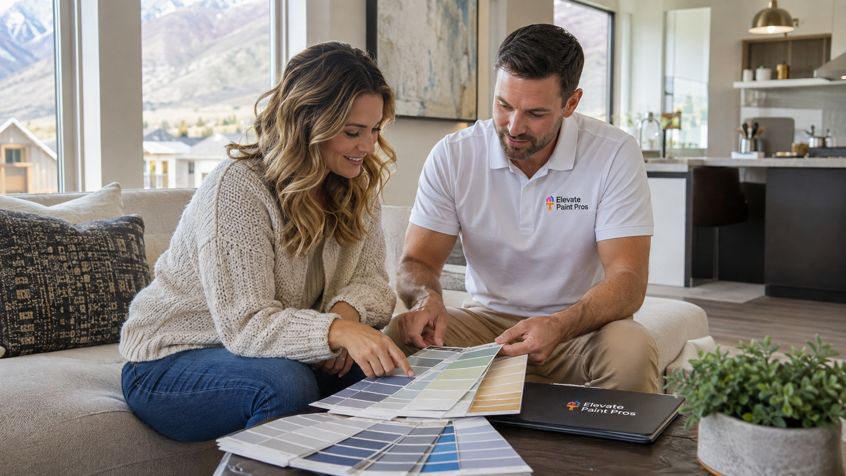
Paint color does more than match your furniture.
The walls you live with every day influence how calm, energized, or focused a room feels. That is not just decorating advice. Decades of psychology research show that people reliably link colors to emotions—and that interior color choices can shape satisfaction, perceived brightness, and even how well a space supports daily activities like studying or relaxing.
For Utah homeowners planning a refresh, color psychology is a practical tool. Strong mountain light, open floor plans, and high-contrast trim mean the same swatch can look different at noon than at sunset. Choosing colors with mood in mind—and testing them in your actual rooms—helps you avoid a palette that feels too dark, too stimulating, or simply "off" once it is on the walls.
At Elevate Paint Pros, interior painting in Utah often starts with how a home should feel, not just which trend is popular this year. This guide connects research to real rooms so you can paint with confidence.
Do Colors Really Affect How We Feel?
Yes—with important nuance. A 2025 systematic review of 128 years of color–emotion research, covering more than 42,000 participants across 64 countries, found consistent patterns: lighter colors tend to pair with positive feelings, darker colors with negative ones, and hues like blue and green often align with calmer, lower-arousal emotions while red and orange tie to higher arousal.
You can read the full open-access summary in Psychonomic Bulletin & Review. The authors note that many studies measure associations people report—not always long-term mood in a furnished home—so context still matters.
For walls specifically, people often prefer lighter versions of a hue than they choose for clothing or small objects. Research on imagined and depicted interiors shows that wall colors are judged more attractive at higher lightness levels—a detail that matters when you are standing in a paint aisle comparing saturated chips to what will cover four walls.
A related study in Psychological Research reinforces that color preferences shift with context. What you love on a poster may feel overwhelming at full scale in a bedroom. That is one reason professional input helps.
What Research Says About Interior Wall Color
One of the most realistic studies on interior color comes from a university residence where six identical buildings differed only by wall color. Students lived in those spaces for more than a year on average—not a brief lab visit.
Published in Frontiers in Psychology, the study reported that blue interiors were the most preferred, followed by green, violet, orange, yellow, and red. Blue was also rated as the most helpful for studying, while highly saturated warm colors were more often seen as distracting. Residents strongly preferred white ceilings, and many wished their wall colors were lighter than what was installed.
Those findings line up with how Utah homeowners use main living spaces: open great rooms and offices need colors that support conversation and focus without visual fatigue. Cool, muted blues and greens are popular for that reason—not because they are trendy, but because they read as calm at scale.
If you are unsure where to start, interior color consultation in Utah can narrow options to a cohesive whole-home plan before a single gallon is ordered.
Warm vs. Cool Colors at Home
Warm colors—reds, oranges, yellows, and many terracottas—tend to feel energetic and social. They can make a large room feel cozier, but strong saturation in a small space may feel intense under bright Utah sunlight.
Cool colors—blues, blue-greens, sage, and blue-violets—often read as restful. The color–emotion review linked above associates blue and green with positive, lower-arousal feelings, which is why soft blues appear so often in bedrooms and home offices.
Neutrals are not neutral psychologically. Warm greige and creamy whites feel inviting; cool grey can feel crisp and modern but sometimes flat if the room lacks natural light. The same systematic review highlights lightness as a driver of emotional response: brighter walls frequently feel more positive, while very dark walls can feel heavy unless balanced with trim, lighting, and furnishings.
Again, the colour–emotion literature review is a useful reference when you are debating between a saturated accent and a softened whole-room tone.
Room-by-Room: Where Color Psychology Matters Most
Living room
Living rooms are where families gather and where guests form a first impression. Colors here should support both relaxation and conversation. Soft warm neutrals, greige, and muted blues or greens usually work well with Utah's bright daylight without competing with art, stone, or mountain views.
Avoid going too dark on every wall unless the room has abundant light and high ceilings; the residence-hall study found darker blues reduced perceived room lightness even when blue was the favorite hue overall.
For a dedicated refresh of your main gathering space, see living room painting in Utah.
Kitchen
Kitchens benefit from colors that feel clean and energizing without harsh glare. Warm whites, soft yellows, light greens, and muted blues are common choices. Very saturated red on large wall areas can increase arousal; that can be great for a accent wall or dining nook but may feel overwhelming behind every cabinet run.
Research on color and cognitive performance found that blue environments can support creative tasks while red can aid detail-oriented work in controlled settings—a finding reported in Science. At home, most people prioritize a kitchen that feels fresh and easy to maintain rather than optimizing for a single task, but it explains why some homeowners choose calmer wall colors and save bold hues for a single accent.
Kitchen painting services should account for grease, moisture, and cabinet colors so the mood you want matches durable products and sheen.
Bedrooms and home offices
Sleep and focus rooms usually benefit from lower-arousal palettes: muted blues, greens, lavenders, or warm off-whites. The Frontiers residence study linked preference for blue with higher "calm" mood ratings compared with orange interiors.
Home offices painted for long work sessions often mirror that approach—soft cool neutrals or blue-grey—while adding warmth through wood, textiles, and lighting so the space does not feel cold.
Hallways, trim, and ceilings
Ceilings matter for mood more than people expect. In the long-term interior color study, about 85% of residents preferred white ceilings over colored ones, partly because lighter ceilings feel taller and brighter.
Crisp trim and baseboard painting frames wall color and affects how "finished" a room feels. Even the perfect wall color can fall flat if trim is yellowed, chipped, or the wrong sheen next to a matte wall.
Lightness, Finish, and Surface Prep Change the Outcome
Color psychology only works if the surface reads evenly. Patchy drywall, flashing, and the wrong finish can make a calming blue look uneven and stressful under raking light—common in Utah homes with large windows.
Drywall repair and prep before painting ensures the hue you chose is what you actually see. Eggshell and matte finishes soften walls; satin on trim adds durability. Those technical choices interact with color: a glossy deep red feels more intense than the same pigment in matte.
Context effects on preference are documented across multiple experiments; see again Psychological Research for how object and setting change attractiveness ratings.
Practical Tips for Utah Homeowners
- Test large samples on two walls—one sun-facing, one shaded—for at least 48 hours.
- Favor slightly lighter values than the chip suggests for whole rooms; research consistently shows walls look better lighter at full scale.
- Keep ceilings and trim light unless you are deliberately creating a moody, intimate space.
- Repeat accent colors in at least two rooms for flow in open-concept layouts.
- Pair stimulating colors (strong red, orange, or yellow) with smaller surface areas or combine with plenty of neutral square footage.
- Consider how flooring, stone fireplaces, and cabinet stains pull warm or cool—undertone clashes undermine even a "calm" blue.
When the goal is a cohesive mood across the house—not just one trendy accent—start with professional color consultation tied to your lighting and existing finishes.
When to Hire a Professional Interior Painter
Choosing color is step one. Execution determines whether that choice feels peaceful or chaotic. Cut lines, consistent sheen, repaired surfaces, and protected floors all affect the final emotional impression of a room.
Elevate Paint Pros helps Utah homeowners translate color goals into durable results—from whole-home repaints to single rooms—with prep standards that match the investment you are making in how your home feels every day.
For an overview of services and estimates, visit Utah interior painting or browse all options at elevatepaintpros.com/services.
Call Elevate Paint Pros: (801) 512-2916